# CSS Scrolling Images

Source: https://www.dandenney.com/posts/front-end-dev/css-scrolling-images
Date: 2025-03-10
Tags: front-end-dev
Summary: A line of CSS to make images scroll

---

<style>
  .blogpost {
    max-width: 100% !important;
  }

  .scroll-wrapper,
  .scroll-wrapper + * {
    margin-block-start: 2rem;
  }

  .scroll-wrapper + .scroll-wrapper {
    margin-block-start: 0;
  }

  .ie {
    background-color: #ffcc00;
    padding: 1rem;
    border-radius: 0.5rem;
    border: 0.5rem solid;
    border-image: repeating-linear-gradient(
      45deg,
      black 0,
      black 5px,
      transparent 5px,
      transparent 10px
    ) 10;
    font-weight: bold;
    overflow: clip;
    transform: rotate(-2deg);
  }

  @supports (animation-timeline: view()) {
    .ie {
      display: none;
    }
  }

</style>

<div class="max-w-2xl mx-auto">

To avoid burying the lede, `animation-timeline` is a magical line of CSS that allows you to animate an element based on the scroll position of the page. If it meets your needs, you can use it to avoid writing JS or adding a library.

## Background
  
I watched a video on [CSS Only Scroll-Based Animations ](https://www.youtube.com/watch?v=LR2AediwJbI) and thought it was a fun idea. However, their version was built for the WP site builder and I wanted to see it in regular ol' code. 

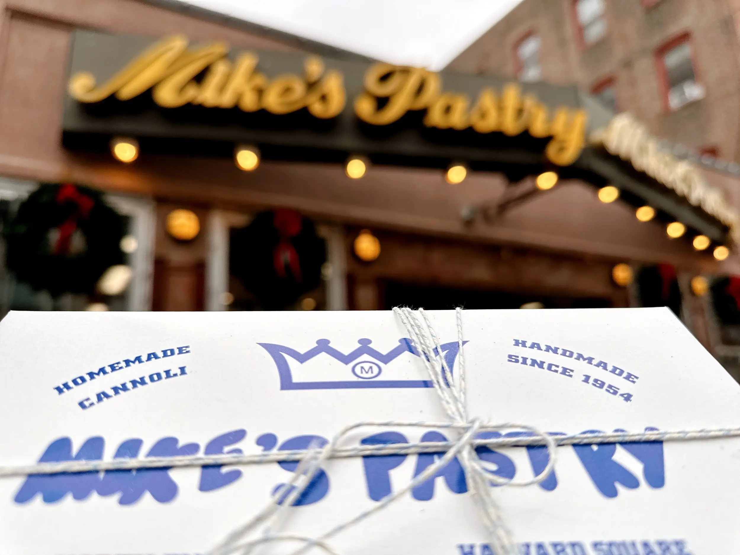
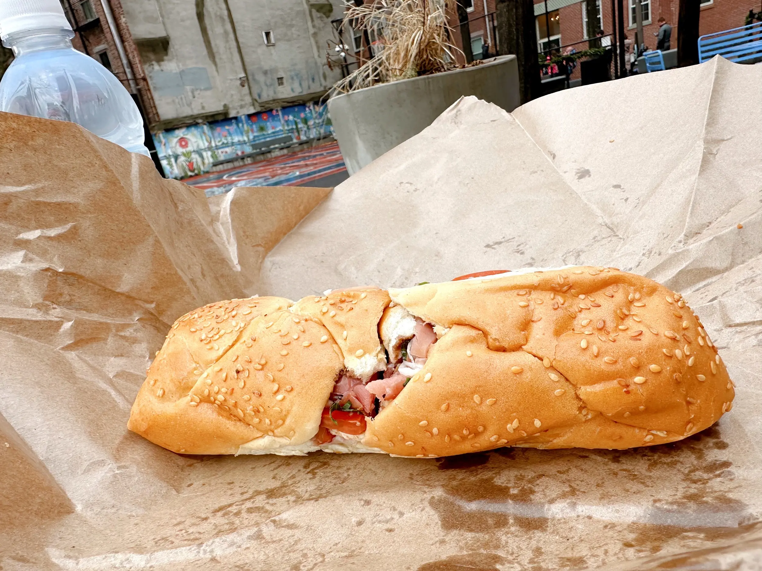
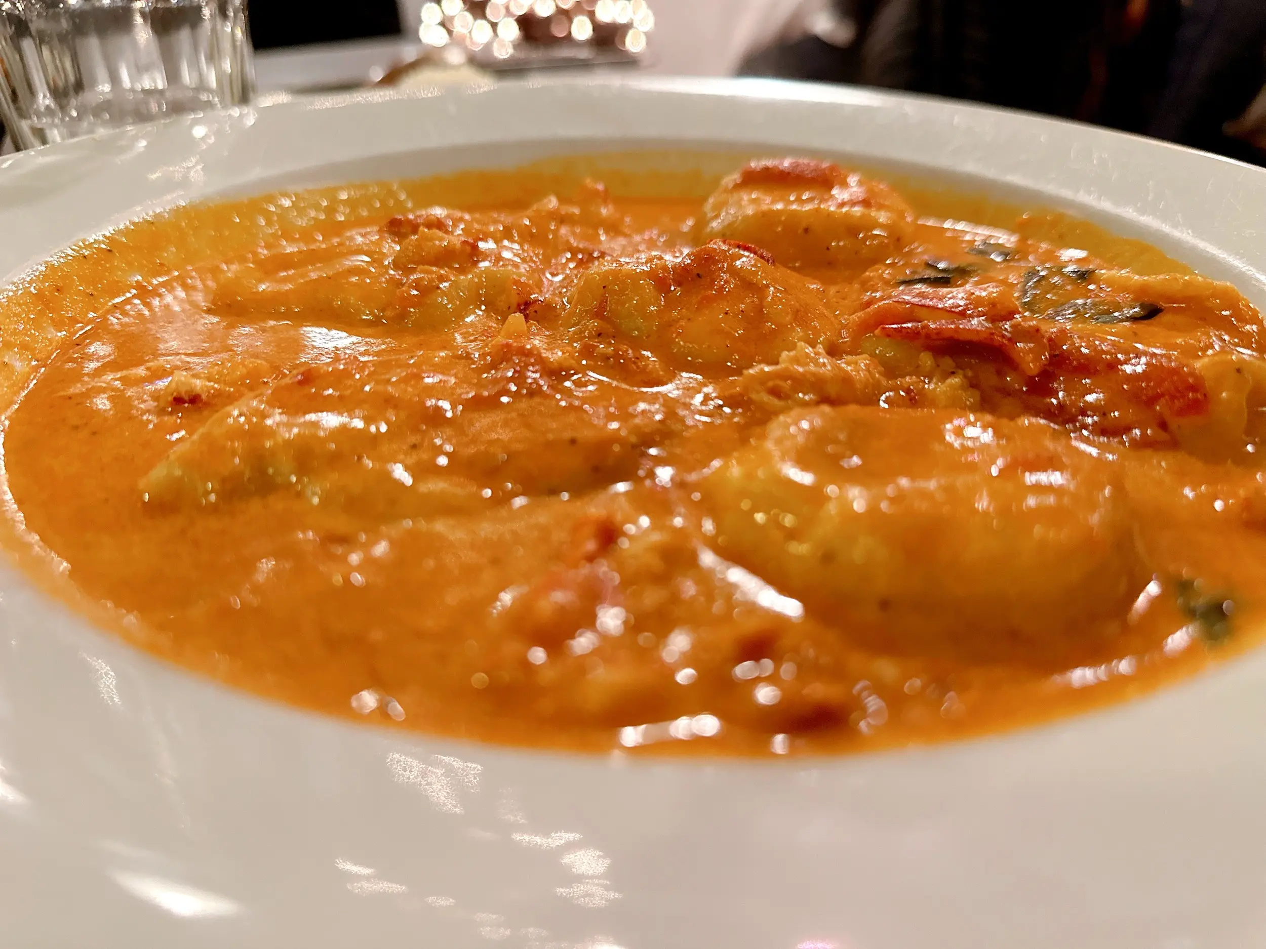
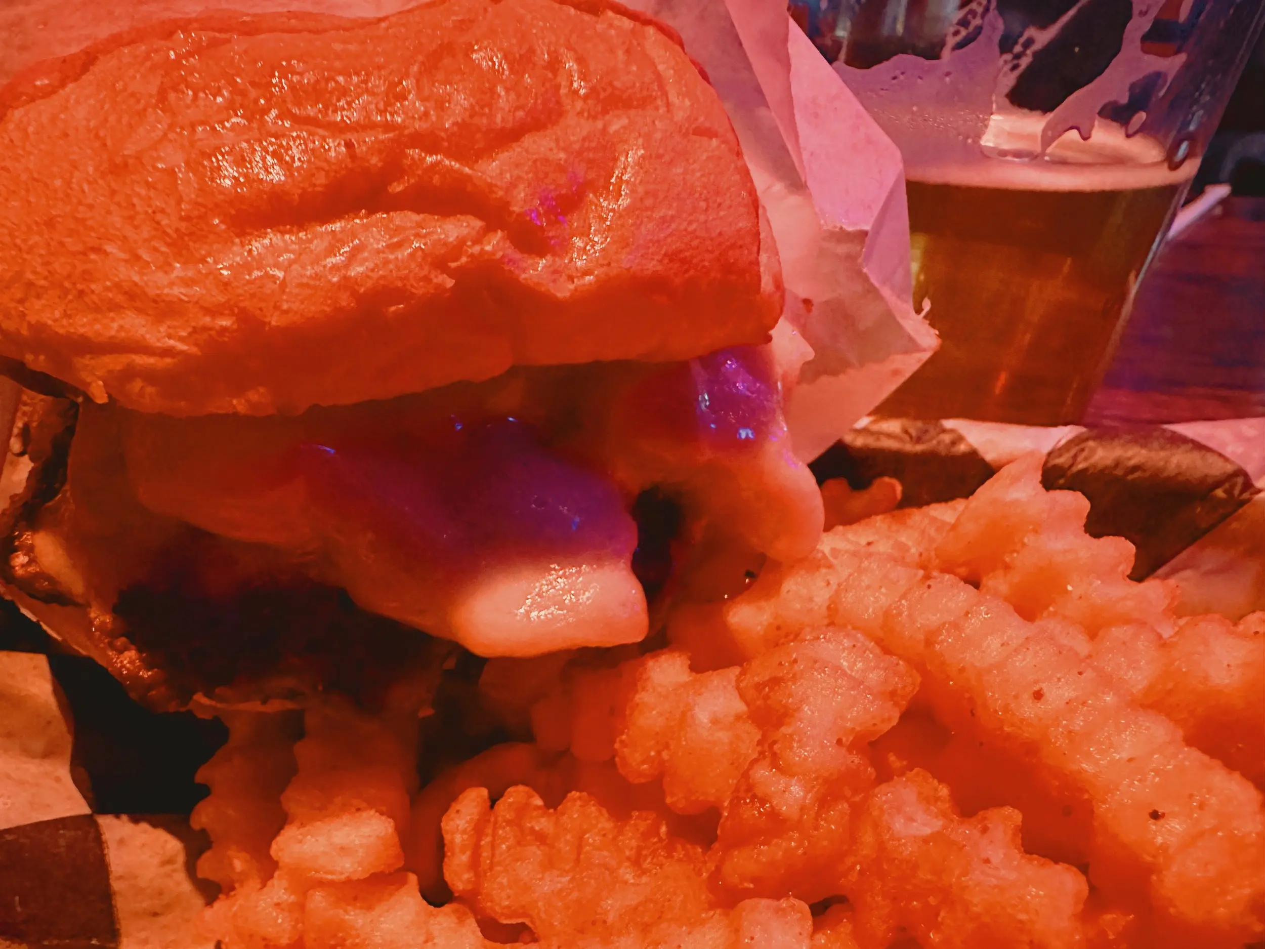
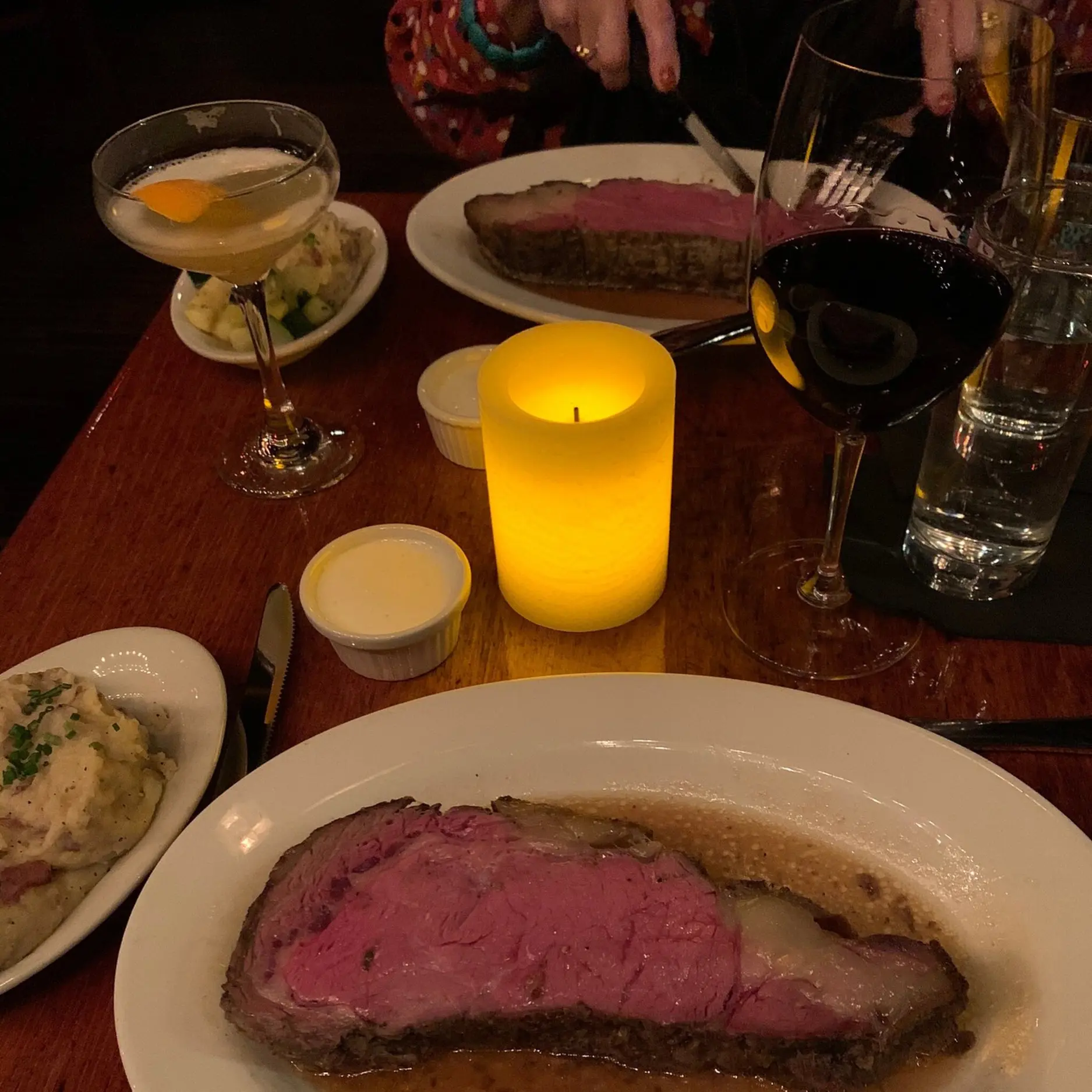
They used logos as the example and it caught my attention because I have rearranged logos in so many shapes in the past few years. To be a little different and play with something else, I decided to use images from my recent additions to [No ReservAItions](https://www.noreservations.com).

## Code Prep

I'll share the HTML, but there's nothing special there. We'll start with some CSS specifically for ensuring the animation only runs if people don't opt out of animations. A lot of times this gets sprinkled in at the end, but I like to start with it.

<div class="code-ui-wrapper"><div class="code-ui-header">CSS</div>

```css
@media (prefers-reduced-motion: no-preference) {
  ...
}
```

</div><!-- Close Code UI -->

Now we'll sprinkle in some HTML and add CSS to handle the basic alignment of them. 

<small>(Disclaimer: if you view source, you'll see some minor code differences but that's to counter my post styles and to add steps to the shares)</small>

<div class="code-ui-wrapper"><div class="code-ui-header">HTML</div>

```html
<section class="scroll-wrapper">
  <ul class="scroll-container">
    <li class="scroll-item">
      <img src="/no-reserv-ai-tions/jack-browns.webp" alt="Photo of a burger and fries" />
    </li>
    <li class="scroll-item">
      <img src="/no-reserv-ai-tions/skulls-rainbow-room.webp" alt="Photo of prime rib" />
    </li>
    <li class="scroll-item">
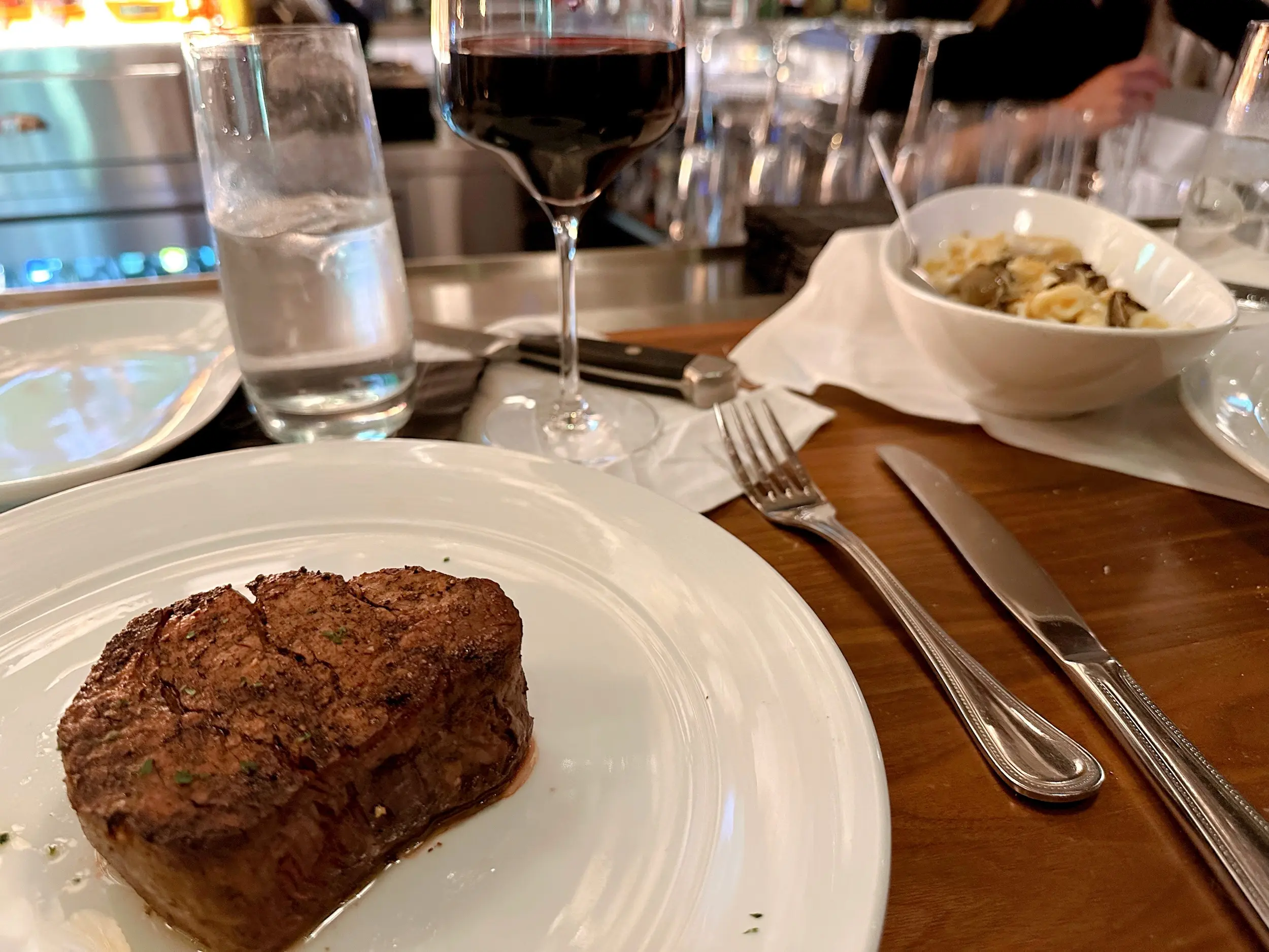
      <img src="/no-reserv-ai-tions/eddie-vs.webp" alt="Photo of a filet mignon" />
    </li>
    <li class="scroll-item">
      <img src="/no-reserv-ai-tions/a-t-o-keeffes.webp" alt="Photo of a burger and fries" />
    </li>
  </ul>
</section>
```

</div><!-- Close Code UI -->

<div class="code-ui-wrapper"><div class="code-ui-header">CSS</div>

```css
.scroll-container {
  display: grid;
  grid-template-columns: repeat(4, 1fr);
}

@media (prefers-reduced-motion: no-preference) {
  ...
}
```

</div><!-- Close Code UI -->

<style>
  .scroll-container {
    display: grid;
    grid-template-columns: repeat(4, 1fr);
  }
</style>

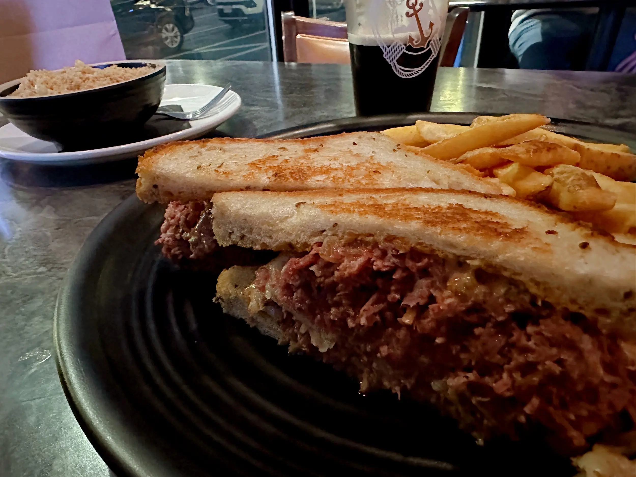
With that, you get some basic images aligned in a grid. Nothing special, but it's a good start and what people will continue to see if they don't want animations. In the logos example, he had them scrolling to the side, but for these photos I thought it would be more interesting to see them scale. As you scroll, it looks like that reuben is coming straight for your mouth!

</div>

<section class="scroll-wrapper">
  <ul class="scroll-container">
    <li class="scroll-item">
      <img src="/no-reserv-ai-tions/jack-browns.webp" alt="Photo of a burger and fries" />
    </li>
    <li class="scroll-item">
      <img src="/no-reserv-ai-tions/eddie-vs.webp" alt="Photo of a filet mignon" />
    </li>
    <li class="scroll-item">
      <img src="/no-reserv-ai-tions/a-t-o-keeffes.webp" alt="Photo of a burger and fries" />
    </li>
    <li class="scroll-item">
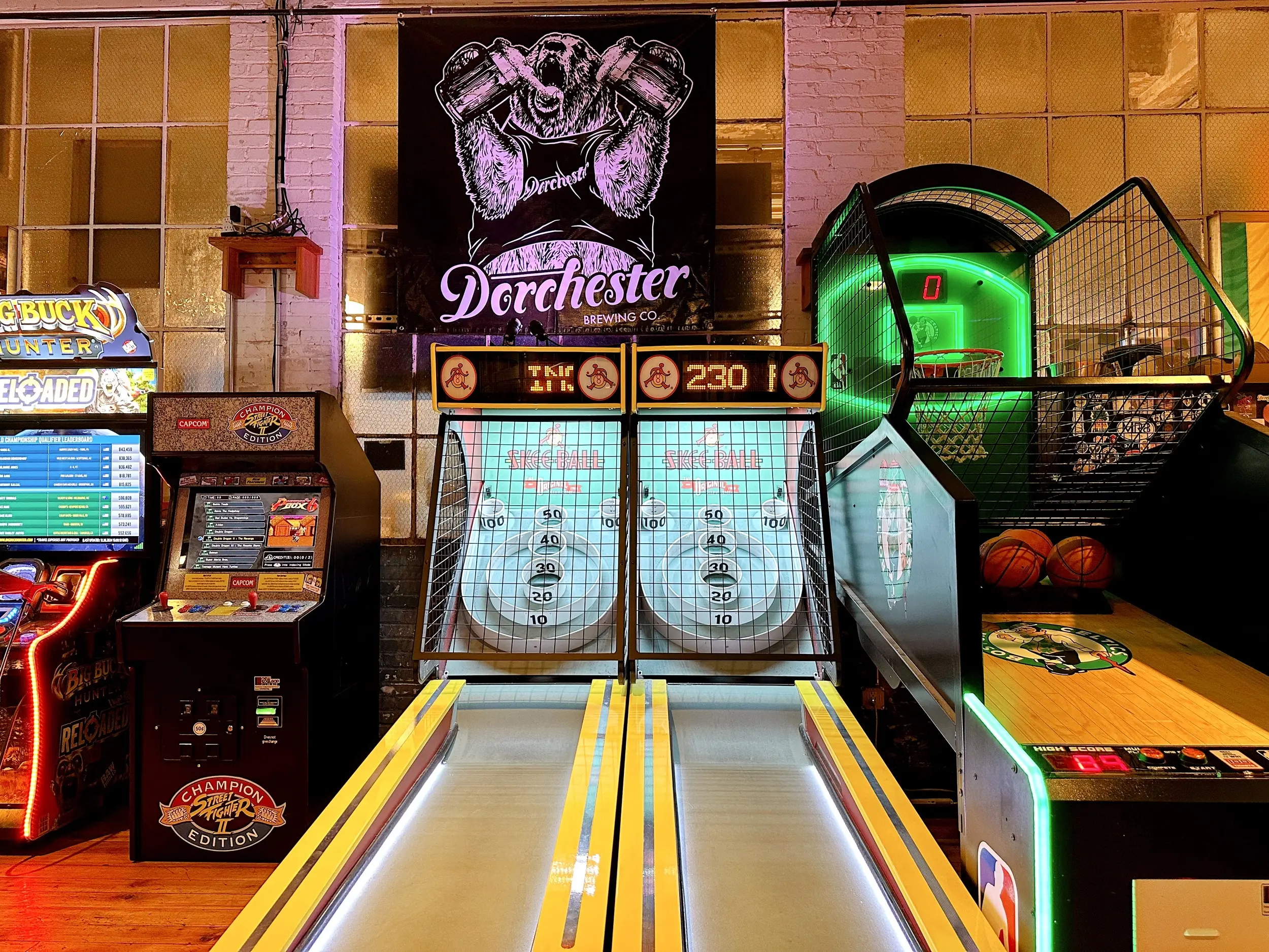
      <img src="/no-reserv-ai-tions/dorchester-brewing.webp" alt="Photo of prime rib" />
    </li>
  </ul>
</section>

<div class="max-w-2xl mx-auto">

Here comes the magic! It's wild that one line of CSS now enables this effect. The rest of the styles are for my personal preferences for the animation and the layout. To be safe, I'm using `@supports` to ensure the various styles only get applied if the browser supports the feature.

<div class="code-ui-wrapper"><div class="code-ui-header">CSS</div>

```css
.scroll-container {
  display: grid;
  grid-template-columns: repeat(4, 1fr);
}

.scroll-wrapper {
  overflow: clip;
}

@media (prefers-reduced-motion: no-preference) {
  @supports (animation-timeline: view()) {
    @keyframes scaleUp {
      to {
        transform: scale(1.4);
      }
    }

    .scroll-container {
      animation: scaleUp ease;
      animation-timeline: view(); /* The one magic line */
    }
  }
}
```

</div><!-- Close Code UI -->

<style>
  .scroll-wrapper {
    overflow: clip;
  }

  @media (prefers-reduced-motion: no-preference) {
    @supports (animation-timeline: view()) {
      @keyframes scaleUp {
        to {
          transform: scale(1.4);
        }
      }
    
      @keyframes rotateItem {
        to {
          transform: rotate(5deg);
        }
      }
    
      .scroll-container.two {
        animation: scaleUp ease;
        animation-timeline: view(); 
      }
    }
  }
</style>

<p class="ie">
 Oh no! It looks like you're using IE, or at least the modern-day equivalent. Just imagine joyful things and check this out on a <a href="https://caniuse.com/?search=animation-timeline%3A%20view()">browser that supports animation-timeline: view()</a> when you have time.
</p>

</div>

<section class="scroll-wrapper">
  <ul class="scroll-container two">
    <li class="scroll-item">
      <img src="/no-reserv-ai-tions/jack-browns.webp" alt="Photo of a burger and fries" />
    </li>
    <li class="scroll-item">
      <img src="/no-reserv-ai-tions/eddie-vs.webp" alt="Photo of a filet mignon" />
    </li>
    <li class="scroll-item">
      <img src="/no-reserv-ai-tions/a-t-o-keeffes.webp" alt="Photo of a burger and fries" />
    </li>
    <li class="scroll-item">
      <img src="/no-reserv-ai-tions/dorchester-brewing.webp" alt="Photo of prime rib" />
    </li>
  </ul>
</section>

<div class="max-w-2xl mx-auto">

There's another little bit that I hadn't used before, `overflow: clip`. I used my standard `overflow: hidden` on the wrapper, but that seemed to inhibit the scaling animation. Clipping the overflow to the content box seems to fix it and it was something I picked up in the original video.

Speaking of the original video, they had a second row where they went the opposite scrolling direction. I thought it would be cool to have some images that scaled down instead of up.

</div>

<style>
  @media (prefers-reduced-motion: no-preference) {
    @supports (animation-timeline: view()) {
      @keyframes scaleDown {
        to {
          transform: scale(1);
        }
      }

      .scroll-container.inverse {
        animation: scaleDown ease;
        animation-timeline: view();
        transform: scale(1.4);
      }
    }
  }
</style>
<section class="scroll-wrapper">
  <ul class="scroll-container two">
    <li class="scroll-item">
      <img src="/no-reserv-ai-tions/jack-browns.webp" alt="Photo of a burger and fries" />
    </li>
    <li class="scroll-item">
      <img src="/no-reserv-ai-tions/eddie-vs.webp" alt="Photo of a filet mignon" />
    </li>
    <li class="scroll-item">
      <img src="/no-reserv-ai-tions/a-t-o-keeffes.webp" alt="Photo of a burger and fries" />
    </li>
    <li class="scroll-item">
      <img src="/no-reserv-ai-tions/dorchester-brewing.webp" alt="Photo of prime rib" />
    </li>
  </ul>
</section>

<section class="scroll-wrapper">
  <ul class="scroll-container two inverse">
    <li class="scroll-item">
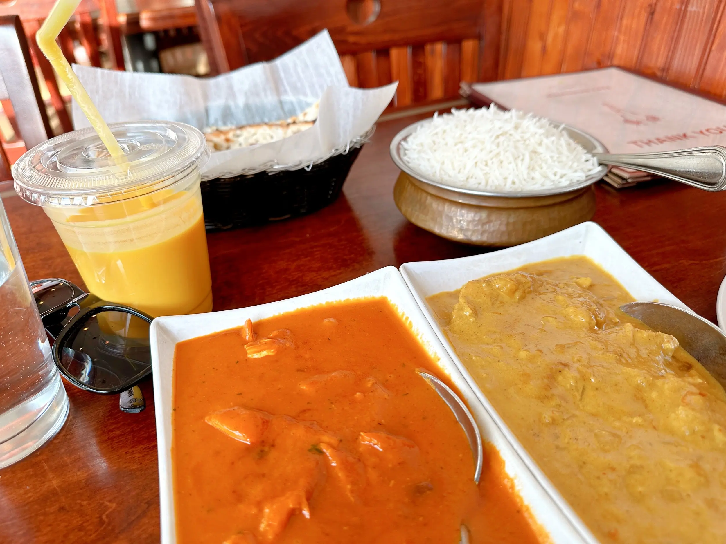
      <img src="/no-reserv-ai-tions/kantipur-cafe.webp" alt="Photo of Indian dishes" />
    </li>
    <li class="scroll-item">
      <img src="/no-reserv-ai-tions/mikes-pastry.webp" alt="Photo of a Mike's Pastry box and sign" />
    </li>
    <li class="scroll-item">
      <img src="/no-reserv-ai-tions/paulis.webp" alt="Photo of an Italian sandwich" />
    </li>
    <li class="scroll-item">
      <img src="/no-reserv-ai-tions/rinos-place.webp" alt="Photo of lobster ravioli" />
    </li>
  </ul>
</section>

<div class="max-w-2xl mx-auto">

This is so much fun! We can debate whether or not this particular effect is useful, but it's a fun way to play with CSS. I have some similar animations throughout the site, but most of it relies on [GSAP](https://gsap.com).

If I was looking to add this to something for work, I'd probably still want to use GSAP for the animation, mainly because of the browser support. (Or [Motion](https://motion.dev))

I highly recommend playing with some scroll-based animations. This is a super simple example, but Adam Argyle has a [notebook](https://nerdy.dev/notebook/scroll-driven-animations.html) that has some fantastic work. And if you're looking to play with this code, I popped it into a [CodePen](https://codepen.io/dandenney/pen/OPJxmpG).
</div>