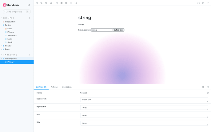
Storybook does not work with Tailwind CSS by default. As a result, if we create a React component using Tailwind utility classes and then create a story based on this component, the Tailwind CSS changes will not be reflected in the Storybook environment.
Note: Using Vite, @storybook/nextjs, or @storybook/preset-create-react-app with react-scripts@2.0.0 and up? You don't need to set postCss to true.
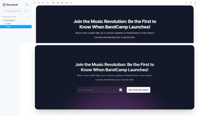 The problem is that the `html` element doesn't get the classes that a page in the Next app does.
```html
```
Most of that is set in the `_document.jsx` file, the exception being the `js-focus-visible` which is dynamic. This is the HTML in the Storybook iframe.
```html
```
I didn't ask the right question for ChatGPT to help here, it wanted to add classes within the component. Google searches won on this one, but again I don't really understand what they're saying here.
Unfortunately, [the docs](https://storybook.js.org/docs/react/configure/story-rendering#adding-to-body) are a little weird here again. They say "You can accomplish this by creating a file called preview-body.html inside your .storybook directory and adding tags like this:"
```html
```
That outputs a `div` before the contents of the time and closes it, but I found [this workaround](https://issuehunt.io/r/storybookjs/storybook/issues/10403).
```jsx
// preview.js
import React from "react";
export const decorators = [
(Story) => (
The problem is that the `html` element doesn't get the classes that a page in the Next app does.
```html
```
Most of that is set in the `_document.jsx` file, the exception being the `js-focus-visible` which is dynamic. This is the HTML in the Storybook iframe.
```html
```
I didn't ask the right question for ChatGPT to help here, it wanted to add classes within the component. Google searches won on this one, but again I don't really understand what they're saying here.
Unfortunately, [the docs](https://storybook.js.org/docs/react/configure/story-rendering#adding-to-body) are a little weird here again. They say "You can accomplish this by creating a file called preview-body.html inside your .storybook directory and adding tags like this:"
```html
```
That outputs a `div` before the contents of the time and closes it, but I found [this workaround](https://issuehunt.io/r/storybookjs/storybook/issues/10403).
```jsx
// preview.js
import React from "react";
export const decorators = [
(Story) => (
```html
```
## We Can Finally Test The Component!
This felt like another round for ChatGPT, so I asked it to give me 5 versions of each with different lengths. It works really well for these examples, but it feels like overkill to paste them in here.
This is a great example of how challenging creating components that allow for content from a CMS can be. This one is highly restrictive, but character counts provide a wildly different experience, especially when they're in the title. I think this would be solved with a combination of some styling tweaks and some suggestions in Strapi itself.
...
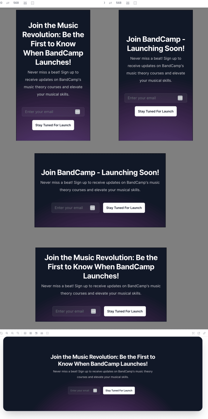
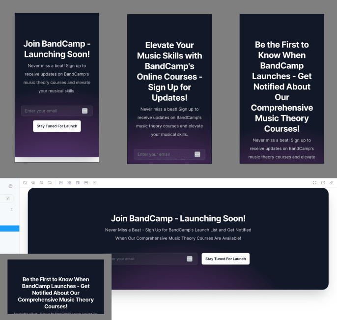 My only beef with how this particular one is built is that there is sizable padding by default. It's especially noticeable in landscape views on small screens. What was built was perfect for the character counts that exist in the original version, but I want some more flexibility. I fixed it up with a minimum of 1 rem padding, using a flex column with a min-height of the screen, and then resetting that when it goes horizontal for the height to adjust by the text at larger screens.
 ## Learning In Two Ways
There's the learnings of how to work around all of the tooling and the component thinking itself, but this also shows how challenging it is to share this part in a blog post. The screenshots are gonna be lame on mobile unless I divide them all up, but that feels like overkill. I think I will start recording a video for future components, especially for the testing part.
That'll do it for now, [here's the PR](https://github.com/dandenney/strapi-series-marketing/pull/4) for the changes in this post. Next up, I'll do a little review of the page to try to plan out some components and see what global changes we'll want to make before I go component-by-component.
## Learning In Two Ways
There's the learnings of how to work around all of the tooling and the component thinking itself, but this also shows how challenging it is to share this part in a blog post. The screenshots are gonna be lame on mobile unless I divide them all up, but that feels like overkill. I think I will start recording a video for future components, especially for the testing part.
That'll do it for now, [here's the PR](https://github.com/dandenney/strapi-series-marketing/pull/4) for the changes in this post. Next up, I'll do a little review of the page to try to plan out some components and see what global changes we'll want to make before I go component-by-component.