Trendy UI with Clip-Path and Grid
13 min read
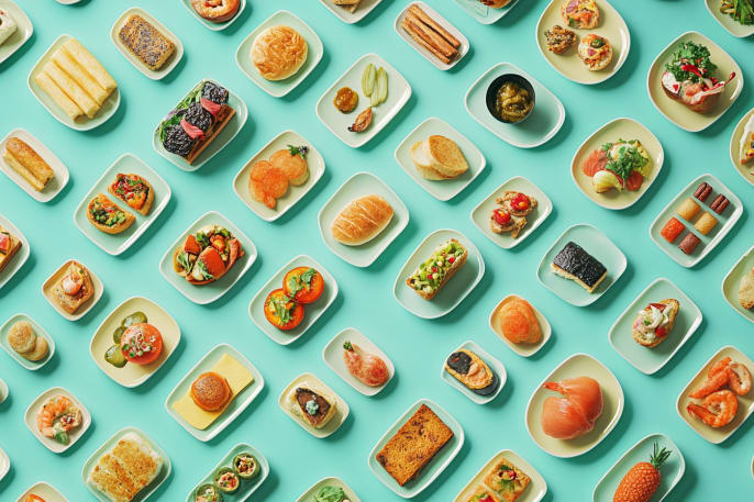
I have been getting more exposure to custom rounding applied to UI elements, with some of the beautiful work featured in Animations.dev and in browsing a lot of mobile UI for inspiration. I was browsing Pinterest, as one does, and imagined the terror that I would have if I was handed a Figma to implement that looked like this. Then, I realized it’s a real site: mode.com
Overall, it’s a striking design on mobile and desktop. Tablet sizes struggle a bit, but I think that’s more about not focusing on them than it is that it was hard to pull off. It seems like mostly spacing issues.
I wanna make it
So now, I need to know how to do it! It’s been a loooooong time since I just grabbed a site and reverse engineered it to figure things out, but that is how I cut my teeth back in the day.
In playing around with dev tools and looking at the styles, it wasn’t clear to me how they pulled off some of the overlaps. I was expecting some complicated CSS Grid system and clip-path or SVG masks, but it seems like a lot of flexbox and inline-block.
(In hindsight, I completely understand. It’s a tremendous amount of work to try to make it responsive and maintain the look. Any letter change would require changing CSS values.)
But I also wanna modernize it a little
Overall it looks amazing, but the semantics are a little rough. The h1 is splt into 3 pieces and ends up being 3 h1 elements. So I’d like to see if it’s possible to avoid that and learn some new techniques. I also want to learn what is and isn’t doable with clip-path.
Mobile-first, of course
The overlay of a smaller image over a larger one is pretty straight forward, except for that inverted border-radius on the larger image. In their version, they are using some interesting techniques. The primary photo is duplicated and then put into sized divs with object-fit: cover;. I’m pretty impressed that I can never make the photo get out of sync, their math is mathing. For having the SVG animations spaced on the top, they’re using absolute positioning.
Let’s get a basic thing working first and then improve upon it. I’m leaning towards CSS Grid here, because I know I can have those two elements overlay each other and and I think we may want more of that behavior as we move up to the desktop version as well.
I don’t want to try to create an exact replica of this, so I generated an image and pulles some colors from it.
The pen has all the HTML and CSS, but here I’m going to focus on the key parts. First things first, we’ll stack two items on top of each other. I always use Sarah Drasner’s CSS Grid Generator for these kinds of things.
CSS
.media-primary,
.media-secondary {
  grid-area: 1 / 1 / 2 / 2;
}

.media-primary,
.media-secondary {
  grid-area: 1 / 1 / 2 / 2;
}

.media-primary {
  aspect-ratio: 346 / 300;
  background-color: ;
  max-width: 100%;
}

.media-primary img {
  object-fit: cover;
  width: 100%;
  height: 100%;
}

.media-secondary {
  aspect-ratio: 122 / 119;
  background-color: #465e5f;
  border-radius: 12px;
  justify-self: end;
  width: 35%;
}
HTML
<main>
  <section>
    <div class="media-primary">
      <img alt="Generated image of some people working at a computer and we're hoping they find the typos" src="https://assets.codepen.io/140/learning-grid-and-clip-path.png" />
    </div>
    <figure class="media-secondary">
      <!-- Secondary media will go here -->
    </figure>
  </section>
</main>
Clip it up, Becky, clip it upppp
I found some awesome resources around clip-path recently. Of course, there’s the OG generator, but it isn’t very easy to customize for complex rounded shapes. There’s this awesome post on using gradients, but this is what I really wanted and found it on Reddit: Corner Inverter.
Using the pixel values of the real thing, I created a shape and exported the code. It offers a few options, but I really wanted to use clip-path. Here’s what it gave me:
CSS
clip-path: path("M12,0H192A12,12 0,0,1 204,12L204,127A12,12 0,0,0 216,139L334,139A12,12 0,0,1 346,151V288A12,12 0,0,1 334,300H12A12,12 0,0,1 0,288V12A12,12 0,0,1 12,0Z");Technically speaking, that works, but it’s not responsive. A little conversation with ChatGPT helped me learn what we need to do for a responsive approach. We need to make a SVG with the clipPath attribute and then use that as a responsive SVG that we’re applying as the value of clip-path. Yo dawg, I heard you like clip-path…
There’s a formula for the conversion, but it’s complex. I’d suggest using some tool for it, but I have a ChatGPT thread I’ve been using for this.
HTML
<main>
  <section>
    <div class="media-primary">
      <img alt="Generated image of some people working at a computer and we're hoping they find the typos" src="https://assets.codepen.io/140/learning-grid-and-clip-path.png" />
    </div>
    <figure class="media-secondary">
      <!-- Secondary media will go here -->
    </figure>
  </section>
</main>

<svg width="0" height="0">
  <defs>
    <clipPath id="preview-two-clip-path" clipPathUnits="objectBoundingBox">
      <path d="M0.035,0 H0.555 A0.035,0.035 0,0,1 0.59,0.04 V0.423 A0.035,0.035 0,0,0 0.625,0.463 H0.965 A0.035,0.035 0,0,1 1.000,0.503 V0.96 A0.035,0.035 0,0,1 0.965,1 H0.035 A0.035,0.035 0,0,1 0,0.96 V0.04 A0.035,0.035 0,0,1 0.035,0 Z" />
    </clipPath>
  </defs>
</svg>
With that HTML, I can then apply that clip-path in the CSS.
CSS
.media-primary {
  aspect-ratio: 346 / 300
  clip-path: url(#preview-two-clip-path);
  max-width: 100%;
}
There’s some copy and CTAs in this area that we need to add in. I know that I’m going to end up using them in a Grid layout, so I’m going to wrap some extra divs around parts. They’re not necessary for the mobile layout, so no new important CSS. I might as well add some classes to select them by as well.
Back to the generator for another clip-path for the heading. I thought it could be a pseudo element at first glance, but the side thingy is not equidistant from the edge of the rest.
HTML
<section>
  <div class="media-primary">
    <img alt="Generated image of some people working at a computer and we're hoping they find the typos" src="https://assets.codepen.io/140/learning-grid-and-clip-path.png" />
  </div>
  <figure class="media-secondary">
    <!-- Secondary media will go here -->
  </figure>
  <div class="text-content">
    <h1 class="text-heading">
      New knowledge built from shared work
    </h1>
    <div class="text-body">
      <p>
        We're building an example that shares code created while learning from others, showing how collaboration and exploration can lead to enhanced outcomes.
      </p>
      <div class="ctas">
        <a class="cta cta-primary" href="https://mode.com">View the original</a>
        <a class="cta cta-secondary href="https://codepen.io/collection/KwKNaN">
          CodePen Collection
        </a>
      </div>
    </div>
  </div>
</section>

<svg width="0" height="0">
  <defs>
    <clipPath id="clip-heading" clipPathUnits="objectBoundingBox">
      <path d="
        M0.044,0 H0.852 A0.037,0.05 0,0,1 0.889,0.05 V0.25 A0.037,0.05 0,0,0 0.926,0.30 H0.963 A0.037,0.05 0,0,1 1.000,0.35 V0.70 A0.037,0.05 0,0,1 0.963,0.75 H0.926 A0.037,0.05 0,0,0 0.889,0.80 V0.95 A0.037,0.05 0,0,1 0.852,1 H0.044 A0.044,0.06 0,0,1 0,0.94 V0.06 A0.044,0.06 0,0,1 0.044,0 Z" />
    </clipPath>
  </defs>
</svg>
Shifting to the full layout
The original version shifts to the full layout at 768px, but I think maybe this part got skipped during QA in the original. Nothing major, but there’s some content overlaps and wrapping issues that we’ll try to avoid with this version.
First things first, we’re going to stack our text content on top of the other grid items. Now that we’re doing responsive things, I made the section a container so that we can use container queries. The only new thing in the HTML is a class, but wanted to share it as a visual for what the CSS is doing.
HTML
<section class="content-container">
  <div class="media-primary">
    <img alt="Generated image of some people working at a computer and we're hoping they find the typos" src="https://assets.codepen.io/140/learning-grid-and-clip-path.png" />
  </div>
  <figure class="media-secondary">
    <!-- Secondary media will go here -->
  </figure>
  <div class="text-content">
    <h1 class="text-heading">
      New knowledge built from shared work
    </h1>
    <div class="text-body">
      <p>
        We're building an example that shares code created while learning from others, showing how collaboration and exploration can lead to enhanced outcomes.
      </p>
      <div class="ctas">
        <a class="cta cta-primary" href="https://mode.com">Mode.com</a>
        <a class="cta cta-secondary" href="https://codepen.io/collection/KwKNaN">
          CodePen
        </a>
      </div>
    </div>
  </div>
</section>
CSS
.content-container {
  container-name: content-container;
  container-type: inline-size;
}

@container content-container (min-width: 768px) {
  .text-content {
    grid-area: 1 / 1 / 2 / 2;
    position: relative;
    z-index: 2;
  }
}
Small screen alert! The demos are best viewed on a screen at least 1200px wide, on mobile they're going to appear the same each time from here.
Just pretend
While I’m trying to use more flexible solutions for this version, it’s still somewhat hacky. So, we’re using Grid, and we’re going to apply grid styles to things, but it’s not a true grid. The items don’t actually know about each other at all. There may be a way to achieve this with a real grid, but I certainly don’t know it. We’re just going to pretend that it’s a real grid as we assign hardcoded values to control space.
We’ll start with putting things in their respective areas first, then we’ll work out styling. I’m loosely following the ratio of the original, so the primary media is around 60% and the secondary media is around 25%;
The heading and text content with the CTAs will be a two-row grid, with the text and CTAs positioned at the bottom. That section will need a bonus div. If you know how to avoid, please @ me in any place you can, but it’s just necessary evil as far as I know, to avoid individually adding widths to the paragraph and the button container. In those times, I err on the side of a bonus div over having to edit multiple widths if things change.
If you pretend real hard, you can see the layout taking shape!
HTML
<div class="text-body">
  <div class="text-body-container">
    <p>
      We're building an example that shares code created while learning from others, showing how collaboration and exploration can lead to enhanced outcomes.
    </p>
    <div class="ctas">
      <a class="cta cta-primary" href="https://mode.com">Mode.com</a>
      <a class="cta cta-secondary" href="https://codepen.io/collection/KwKNaN">
        CodePen
      </a>
    </div>
  </div>
</div>
CSS
@container content-container (min-width: 768px) {
  .media-primary {
    width: 60%;
  }

  .media-secondary {
    aspect-ratio: 240 / 230;
    width: 25%;
  }

  .text-content {
    grid-area: 1 / 1 / 2 / 2;
    position: relative;
    z-index: 2;
    display: grid;
    grid-template-rows: 1fr auto;
  }

  .text-body {
    display: flex;
    justify-content: flex-end;
  }

  .text-body-container {
    padding-inline-start: 1.5rem;
    width: 40%;
  }
}
Small screen alert! The demos are best viewed on a screen at least 1200px wide, on mobile they're going to appear the same each time from here.
Putting lipstick on this “pretend”
The original uses widths and duplication to achieve thier effect, which does have some easier things for scaling. I could technically do a mid-size clip-path for some of the styles here and then a full-size, but I’m going to take the spirit of the full size and apply it from 768px up.
First things first, we need a new clip path. On mobile, the “top” of the primary media is more thick. My process for that is: draw the shape in Corner Clipper, copy the mask, paste the mask into a ChatGPT thread, where it gives me a SVG equivalent, add that in CSS.
Next up, is the heading and this is a bit of a doozy. The original duplicated the h1 and I really want to avoid that so that a screenreader or a crawler could read the whole thing. I can’t avoid peppering it with spans, though, to make it a grid. I’m using the same approach as the original and I want to keep it flexible for the background, so I had to add some SVGs to the h1 as well. The cool thing is that it’s a single item that you can highlight the text on.
Reminder: the full code is in the pen, so here I’m just going to show the new SVG, the h1 spanification, and the CSS updates.
Small screen alert! The demos are best viewed on a screen at least 1200px wide, on mobile they're going to appear the same each time from here.
I originally started trying to shift this responsively and I can definitely why they made the choices that they mode on mode.com. So, for this version, it’s only the full size version styles. One thing I kept running into issues with has having the h1 as a direct Grid child, so we ended up with another bonus div.
Seems like overkill to display all of this, but here we go…
HTML
<div>
  <h1 class="text-heading">
    <span class="text-heading-aligned">
      <span class="span-1" id="first-line">Gaining knowledge</span>
      <span class="span-2">by building <svg class="pseudo-corner" xmlns="http://www.w3.org/2000/svg" fill="none" viewBox="0 0 12 12" aria-hidden="true" role="presentation"><path fill="currentColor" d="M12 12C12 5.373 6.627 0 0 0h12v12Z"/></svg><svg class="pseudo-corner" xmlns="http://www.w3.org/2000/svg" fill="none" viewBox="0 0 12 12" aria-hidden="true" role="presentation"><path fill="currentColor" d="M12 12C12 5.373 6.627 0 0 0h12v12Z"/></svg></span>
    </span>
    <span class="span-3">web things <svg class="pseudo-corner" xmlns="http://www.w3.org/2000/svg" fill="none" viewBox="0 0 12 12" aria-hidden="true" role="presentation"><path fill="currentColor" d="M12 12C12 5.373 6.627 0 0 0h12v12Z"/></svg></span>
  </h1>
</div>
Then, here is the new SVG for the full screen clip-path.
<svg width="0" height="0">
  <defs>
    <clipPath id="preview-eight-clip-path-full" clipPathUnits="objectBoundingBox">
      <path d="M0.0188,0 H0.5203 A0.0188,0.0308 0,0,1 0.5391,0.0308 V0.2769 A0.0188,0.0308 0,0,0 0.5578,0.3077 H0.9813 A0.0188,0.0308 0,0,1 1,0.3385 V0.9692 A0.0188,0.0308 0,0,1 0.9813,1 H0.0188 A0.0188,0.0308 0,0,1 0,0.9692 V0.0308 A0.0188,0.0308 0,0,1 0.0188,0 Z" />
    </clipPath>
  </defs>
</svg>
CSS
@container content-container (min-width: 1000px) {
  .preview-eight .media-primary {
    clip-path: url(#preview-eight-clip-path-full);
    width: 45%;
  }

  .preview-eight .media-primary {
    aspect-ratio: 320 / 195;
    width: 53%;
  }

  .preview-eight .media-secondary {
    aspect-ratio: 250 / 205;
    width: 21%;
  }

  .preview-eight .text-body-container {
    font-size: 1.125rem;
    padding-inline-start: 1.5rem;
    width: 47%;
  }
}
Small screen alert! The demos are best viewed on a screen at least 1200px wide, on mobile they're going to appear the same each time from here.
A small break for fun
The responsive bit is challenging, but the full screen looked so good that I wanted to add the animation in the top right and get this so fresh and so clean, clean. Then, I will get back to wrangling four sections to play with each other across resolutions.
I used a combination of Midjourney and ChatGPT to make some icons and style them like the main image. I’m not going to go crazy and match the animation from the original, but I thought we should at least have something.
HTML
<div class="media-secondary">
  <figure class="animated-icon">
    <img alt="illustration of a laptop" src="https://assets.codepen.io/140/laptop.webp" />
  </figure>
  <figure class="animated-icon">
    <img alt="illustration of a grid" src="https://assets.codepen.io/140/grid.webp" />
  </figure>
  <figure class="animated-icon">
    <img alt="illustration respresenting a clip-path" src="https://assets.codepen.io/140/clip-path.webp" />
  </figure>
</div>
CSS
.media-secondary {
  display: grid;
  position: relative;
  overflow: hidden;
}

.animated-icon {
  align-items: center;
  display: flex;
  justify-content: center;
  grid-area: 1 / 1 / 2 / 2;
}

.animated-icon img {
  height: auto;
  opacity: 0;
  width: 80%;
  animation: rotateImages 9s infinite cubic-bezier(0.4, 0, 0.2, 1);
}

.animated-icon:nth-child(1) img {
  animation-delay: 0s;
}

.animated-icon:nth-child(2) img {
  animation-delay: 3s;
}

.animated-icon:nth-child(3) img {
  animation-delay: 6s;
}

@keyframes rotateImages {
  0% {
    opacity: 0;
    transform: scale(0.8);
  }
  5% {
    opacity: 1;
    transform: scale(1.1);
  }
  10% {
    transform: scale(1);
  }
  30% {
    opacity: 1;
    transform: scale(1);
  }
  33% {
    opacity: 0;
    transform: scale(0.8);
  }
  100% {
    opacity: 0;
    transform: scale(0.8);
  }
}
Small screen alert! The demos are best viewed on a screen at least 1200px wide, on mobile they're going to appear the same each time from here.

Back to the Grind
Back in my day, I’d have made this work on an 800x600 and a 1024x768 monitor and called it a day, but instead we’ll get this thing working across viewport sizes. I blame Ethan. If I was going to be shipping this for prod, I’d put a lot more work into this, but I’m going to target specifically the things that look a little janky when you hit them.
This doesn’t get it perfect, but no size that you’d load in has glaring jankiness. If you do front-end or design, the variance in the gaps will drive you nuts, but I’ll save those kinf of fixes for when this would be a real thing.
I don’t love some of the issues still and I think I could find some creative solutions for it, but the real goal was learning the clip-path part. I’ve learned a good amount about that and will now know the respnsive challenges for UIs like this.
If you’re interested in fixing it, fork this pen and show me your tricks!
Small screen alert! The demos are best viewed on a screen at least 1200px wide, on mobile they're going to appear the same each time from here.
See the Pen Trendy UI with Clip-Path and Grid by Dan Denney (@dandenney) on CodePen.